What you’re reading: This is a drop from the Docebo DRIP (Data, Research, and Insights Program). Every two weeks, we release fresh, data-packed insights. Expect hard stats, sharper truths, and takeaways you can use right now to elevate L&D.
Nothing tanks a learning platform faster than a bad user experience.
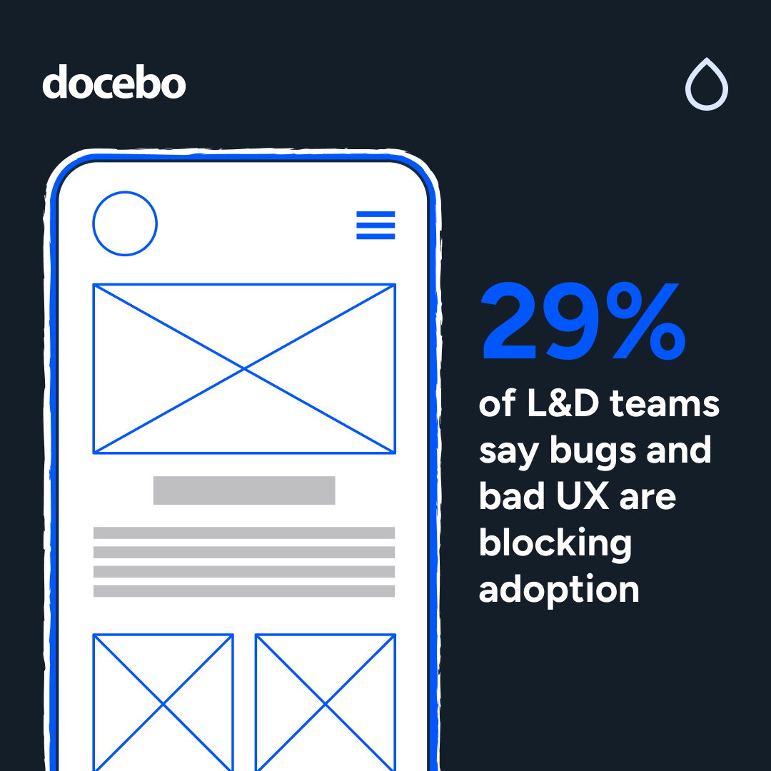
And yet, 29% of L&D teams still cite bugs, clunky interfaces, and poor UX as major blockers.

The problem isn’t just technical. It’s psychological. If learners log in and the first thing they feel is frustration, good luck getting them to come back.
The best organizations know better. The Experience Architects (33%) are demanding sleek, intuitive design—learning tools that deliver all the function, none of the frustration. They want tools that work hard, while keeping it simple.
And the data backs them up:
- 97% of successful implementations focus on clear navigation. If people can’t find what they need in two clicks or less, they’ll give up.
- 42% emphasize the importance of visual hierarchy. Learners don’t want to guess what’s important. Layouts, not manuals, should guide the way.
- 1/3 prioritize mobile-first thinking. Because if the platform doesn’t work where learners are, it doesn’t work. Period.
Curious what mobile-first looks like in real life?
See how Brinkmann Constructors brought learning to field teams and drove a 90%+ adoption rate with a branded mobile learning app.
ICYMI: User experience isn’t “nice to have” anymore. It’s the difference between adoption and abandonment. You can pour money into content, but if the platform feels like a relic, no one’s sticking around long enough to use it.
The bottom line
UX isn’t just design. It’s strategy. The smartest L&D teams are doubling down on navigation, clarity, and mobile-first experiences. Because when learning feels effortless, learners keep coming back for more.