Introduction
The look and feel of your platform is composed of a set of interface elements that you as the Superadmin can customize to optimize the learning experience and the overall user experience of your platform, both on desktop and on mobile. These elements can be set globally, or for individual clients of the Extended Enterprise. Some of these elements include the header and footer, custom CSS, which buttons appear on the login page, and more.
This article describes how to configure the branding, look&feel of your desktop platform. Refer to this article for mobile configuration.
Accessing Your Look & Feel Settings
To reach the look & feel management area of your platform, access the Admin Menu from the gear icon in the top right corner of your platform, then press the Configure Branding and Look button in the Settings section. The page shows the Desktop tab by default. Go through each section of the configuration page to customize the theme as desired.
Customizing Headers
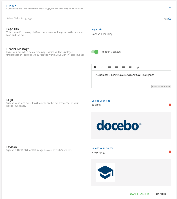
In the Header section, you can customize the platform with your title, header message, logo, and favicon. Please note that for the text fields in this section, you can create them in multiple languages using the multilanguage selector tool, which is accessible from the globe icon in the top right corner of the section. Refer to this article to learn more about using this tool.
Begin in the first section, Page Title. Use the corresponding text field to type in the title of your platform. It will appear in browser tabs and the top bar on the homepage of your platform. Please note that there is a 1000 character limit for this text field before it is cut off by an ellipsis.
Then, flag the option to enable a header message in the corresponding section. When this option is enabled, you can type your header message into the text field below. This could be your company slogan, vision, etc. The text can be edited as desired using the toolbar at the top of the text box. The header message will appear below your logo in your platform as well as on the Sign In page. Please note that there is a 340 character limit for this text field before it is cut off by an ellipsis.
In the Logo section, press the Choose File button to select an image for the logo. In order to grant good performances on page loading, and to avoid issues with features like reports, we suggest uploading a maximum of 380x72px logo image, and to make sure that the image height is not smaller than 36px. The maximum image file size is 2MB and the allowed formats are JPG, PNG, JPEG and GIF. Your new logo will then appear in the top left corner of the platform. You can also upload a custom favicon. This is the icon shown on the browser’s tabs and top bar. Press the Upload your Favicon button, then select a 16×16 png image from your computer. Please note that you may experience problems in the favicon display when using Safari due to Safari limitations on the dynamic favicon loading.
You can use globe icon in the top right corner of this section to create the Header Message in multiple languages using the platform’s multilanguage tool, but the Page Title can only be added in one language.
Customizing the Sign In Page
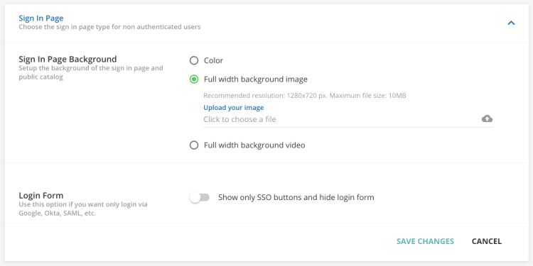
In the Sign In Page Background section, flag which kind of background you want. If you flag the option to have a color background, select the color using the tool that will appear below, or enter the corresponding HEX code.
If you flag the option to add a full width background image, press Upload your Image. The supported formats are JPG and PNG. The recommended resolution is 1280×720 px, and the maximum file size is 10 MB. If you want to delete the image, select the red trash can icon.
If you have activated a public catalog on the Course Catalog tab on the Advanced Settings menu, please note that only the color background and the background image are available, while the background video is not available. If you have activated (or plan to activate) a public catalog in your platform, consider using a smaller image, since the area dedicated to the background image is partially overlapped by the catalog area.
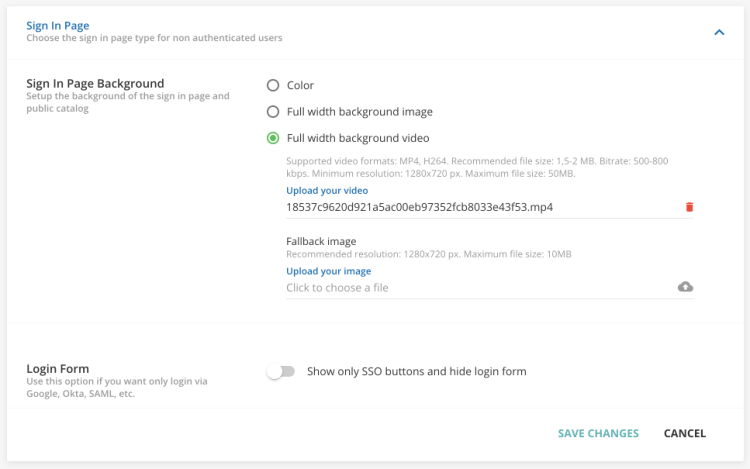
If you flag the option to add a full width background video, press Upload your Video. The supported video formats are MP4 and H264. The suggested specifications for the file are: recommended file size 1,5-2 MB; bitrate: 500-800 kbps; minimum resolution: 1280×720 px; maximum file size: 50MB.
You can also insert a fallback image that will be displayed in case the video is not supported or not loading properly. If you want to delete the video or image, select the red trash can icon.
In the Login Form section, you can flag the option to hide the standard platform login form and show only the SSO buttons for login (Gmail, OKTA, LinkedIn, etc) both on desktop and on mobile. Please note that you should have your SSO integration properly configured and tested before flagging this option.
Customizing Colors
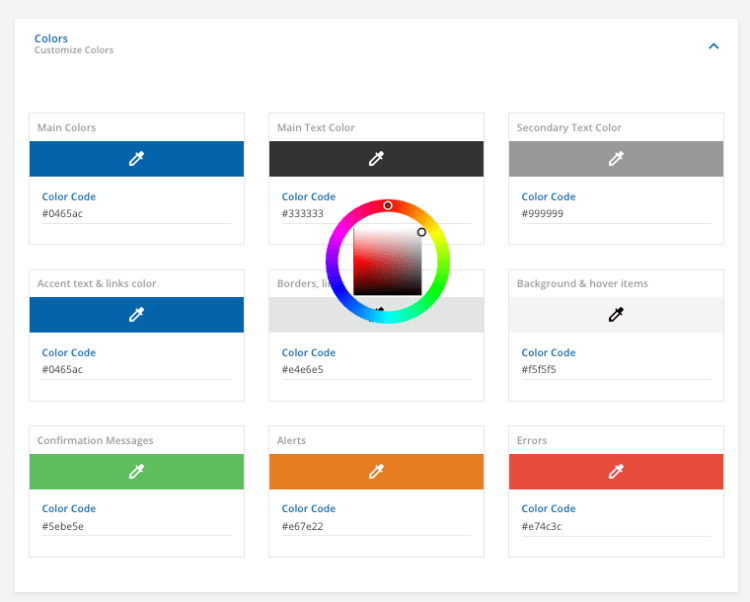
In the Colors section, you can select the colors of each kind of font in your platform. Enter the HEX codes into the corresponding text boxes, or select colors using the color wheels.
There are different ways to get the right HEX color, but if you don’t have any specific graphic software, you can simply use this free website.
Custom Styles
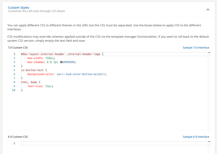
If you have basic knowledge of CSS, you can customize the layout of your desktop platform at a higher level. Use the CSS areas in this section to customize the elements of the desktop platform: font, size, style, etc. Identify the element you want to modify along with the specific attributes. The CSS text areas have a code editor embedded so that you can take advantage of the options available within the editor itself.
Here are some best practices for your customization:
- Save your current settings in a document or a file, so you can easily get them at any time
- Test your changes on your browser inspector before applying them to your live environment.
- Keep two tabs or windows open, one to make your changes in this area, and another one to view any changes in incognito mode or in another browser.
In addition, you can customize via CSS the layout of every single desktop page and widget, since every platform page and widget is identified by a unique ID in the CSS HTML, automatically assigned by the platform.
Your customized CSS could be affected by new releases. In this case, any backward-compatibility with your code is not guaranteed.
As of January 26, 2021, new areas of your desktop platform will become accessible, including built-in pages and page widgets. If you have customized the layout of the newly accessible areas of your platform via CSS, you may be required to update it in order to adapt to its new format. For this reason, starting on January 20, 2021, Superadmins will be able to test directly on your platform if your current CSS is compatible with the one that will be released on January 26, 2021. Find out more in our Knowledge Base.
Customizing the Course Player
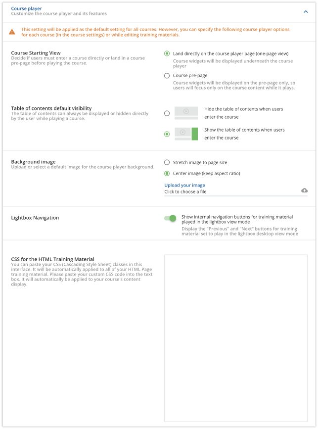
In the Course Player section, you can customize the global course player settings. Please note that any settings configured in this section will be applied as the default settings for all courses, but you can specify local course player settings for individual courses in a course’s Advanced Settings menu, or while editing training materials.
In the first section, flag whether you want to globally activate the course pre-page (overview page) for all courses. The overview page can be for all course types: E-Learning, ILT Classroom, and Webinar. While it is optional for E-Learning courses, it is mandatory for ILT Classroom and Webinar courses. This means that the course pre-page will appear for ILT Classroom and Webinar courses, regardless of which option you flag in this section.
Then, flag whether you want the table of contents panel to be displayed by default when a user enters the course player page. The table of the contents display can be managed directly by the learner by using the panel button on the course player page. In the Background Image section, you can upload an image that will display as the background of the course player. After uploading an image, flag whether you want to stretch the image to the size of the page, or if you want to keep the aspect ratio and center the image on the course player page.
Then, use the toggle to decide whether to show or disable the navigation buttons for any training material played in the lightbox view mode. You can also set this option locally for specific courses in a course’s Advanced Settings area.
Finally, you can add custom CSS for your HTML Page learning objects. In this section, you can copy and paste your CSS classes. It will be automatically applied to all of your HTML Page training material.
Best practices and Tips
If you are not a graphic designer, follow these simple suggestions:
– Follow your official website’s look and feel. Try following the same structure and colors as close as possible.
– Keep it readable. Double-check the contrast between text/background or logo/background. If you modify the font-size, remember that it should be readable on the device of your user.
– Less can be more. If you don’t have any style guide, try to start from the colors of your logo.
– Preview the theme before going live. Check your final results, and consider asking others in your company about their learning experience based on your changes.

